Blog
test
Beneath the Baldachin
Bion S1X
mels sALvage
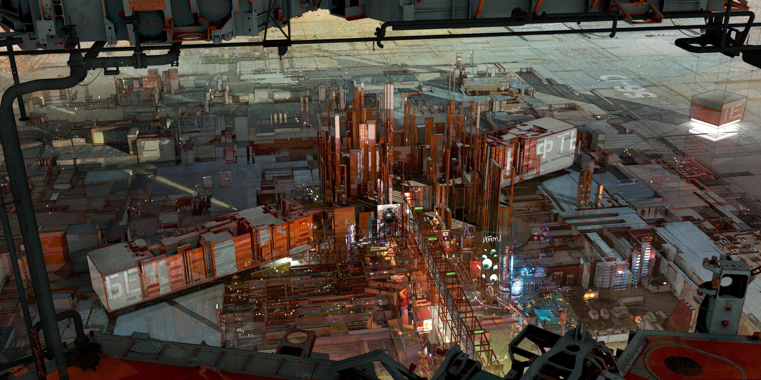
Just something that caught my eye in terms of a rolled camera view. The artwork of Ladronn is very cinematic and I really liked one particular show he created for a futuristic cityscape. So the result was a similar view angle with a different architype and color pallet. Stay safe…
Ebsen's Curse
Untitled - idea 024
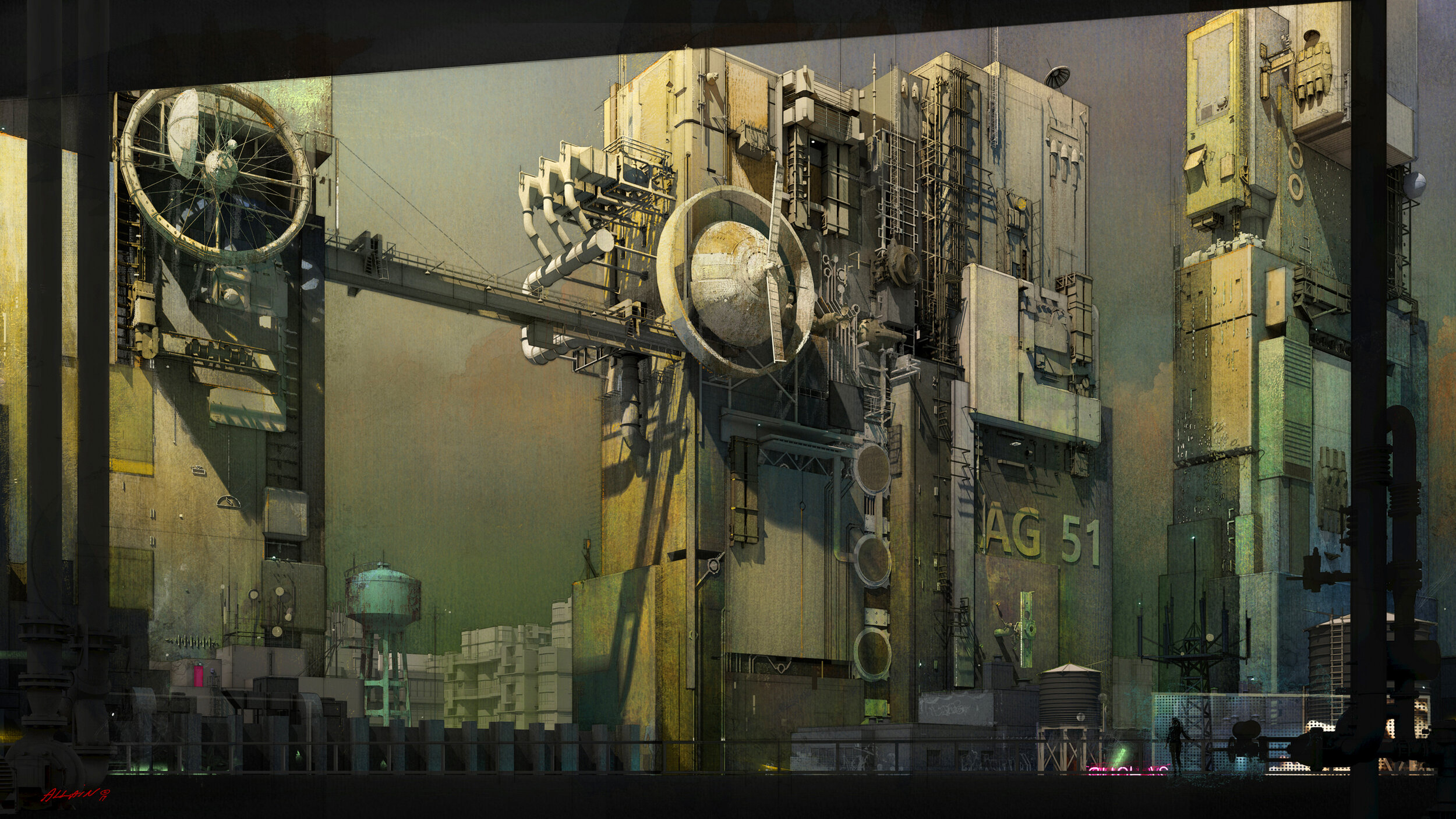
Inspired by the work of Vitaly Bulgarov and his terrific megastructures.
The City Nobody Sees
Pearls Pianos and Parasites
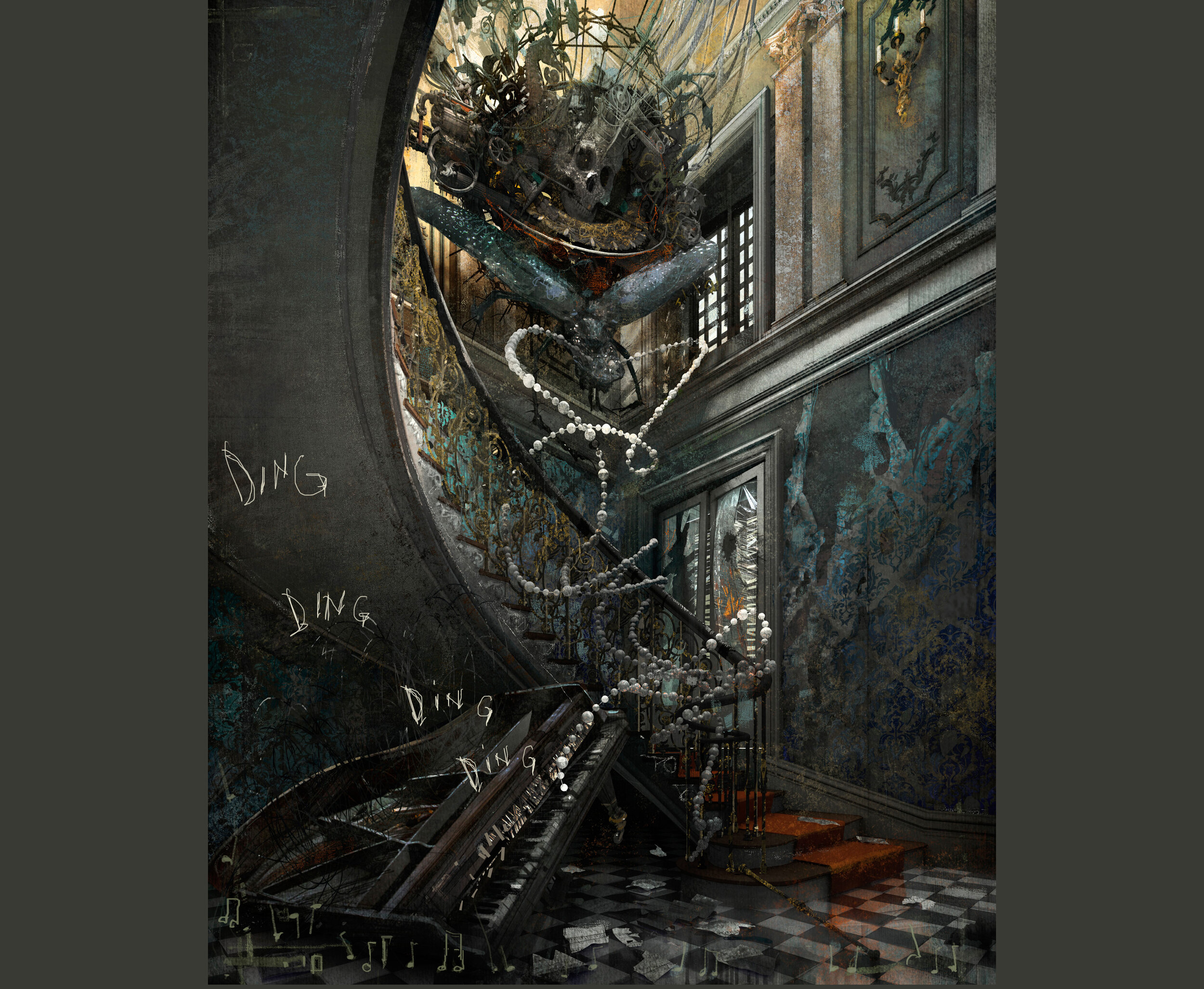
Inspired by a photo from Roman Robroek and the sculptures of Kris Kuksi.
Inktober 2019
The Barnacle
Idea 03 Concept
Actually there was an image that a drew inspiration from. Here is a study I did for a tower to replace the obelisk and the inset is an image I came across and saved in my Inspiration folder.
Idea 03
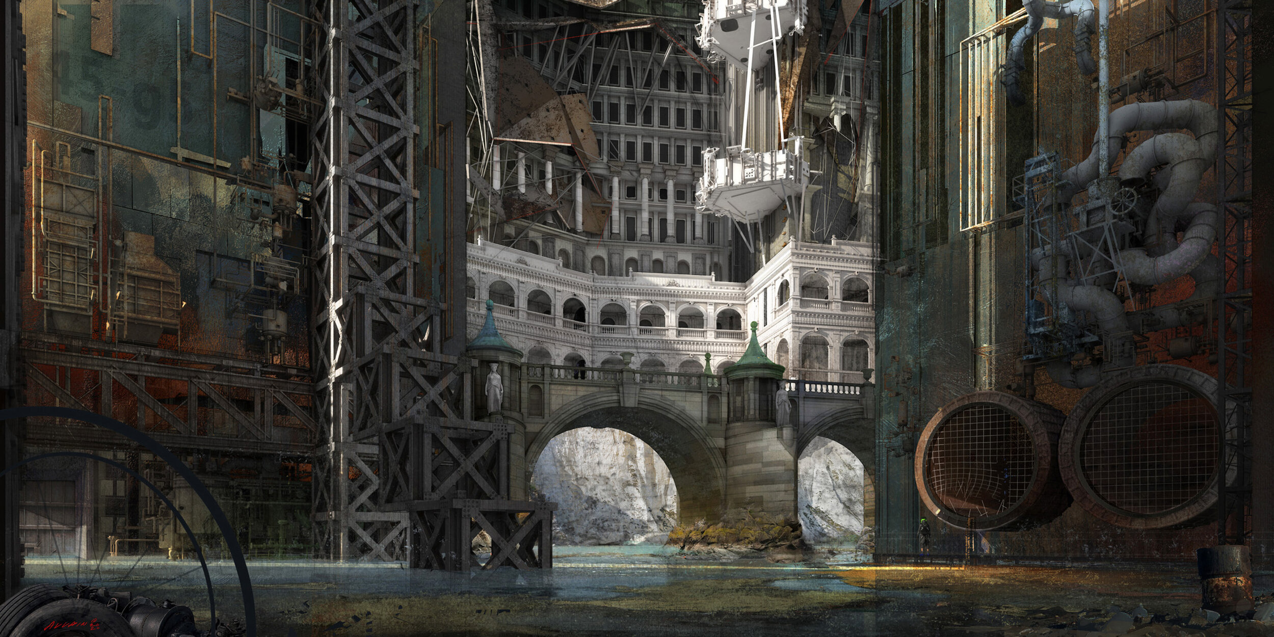
This one was from earlier this year. I suppose it is something that was partially inspired by my time in Venice. From a digital painting standpoint, the sky was most challenging. Fading color pallets take a great deal of time with the goal of producing (or practicing) color with depth.
Refigerator Magnet
Fear of Heights
“Over the great bridge, with sunlight through the girders making a constant flicker upon the moving cars, with the city rising up across the river… the city seen for the first time, in it’s first wild promise of all the mystery and the beauty in the world.” F. Scott Fitzgerald
The Composer Turns His Back
This is the rendered result of the recently posted facade studies. The 3d model was created in Cinema4D and then the final painting was done in Photoshop CS5. With this piece, I started with a design without any sort of environment to put it in. Si I simply settled on a city scene. For this one. It came out a little dark but I was happy with the sky.
Arch Study 001
This is a study for a new building facade idea that I had been working on recently. I used Cinema4D and experimented with the Poly FX and Moextrude modifier .
Bibles and Broomsticks
New image I completed recently that was supposed to be of an abandoned church interior. I saw a photo of this interior and decided to build a version in 3d and paint it in photoshop. I was originally inspired by the serpentine geometry of the pews. This illustration was less about color as it was trying to express the geometry of the overall space while at the same time portray the dominance of the light shaft coming from above.
Alone
I have recently been studying the fantastic water color work of Dusan Djukaric and wanted to work on a piece that tries to capture his color pallet. I am also working through design issues for the architectural language that is supposed to be based in a derelict setting.
Broken Umbrella
I have been working on this image for a few weeks on and off. It was inspired by a photo (b+w) of an entry canopy somewhere. I was going to make this a snow scene but chickened out. I was also considering making this a three panel image because I had a tough time deciding how best to crop.
Art and Artifact
Been a while since the last post. recently discovered the incredible work of Robert Bunkall. This rendering started out as an idea to display a rather simple art piece that I was thinking of. Lots of traffic at the base of some classical architectural fenestration. I was taken back by RB’s use of surrealism and tried to bring it into this piece. Thanks for looking, Cheers!

