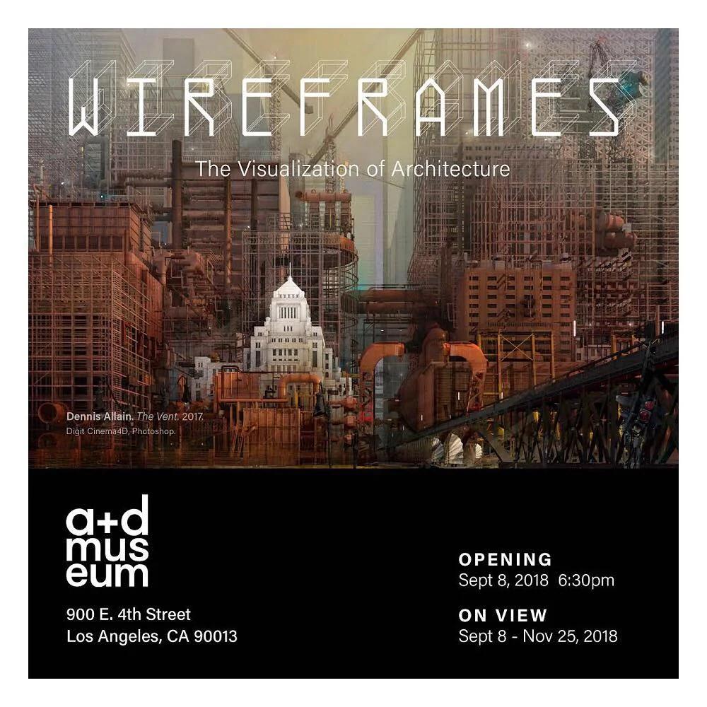
So happy to have been included in this show! Some amazing works on display at the A+D Museum. If your in the area be sure to check it out. A huge thank you to Eric Stultz and his team for there patience and guidance throughout the process. Congratulations to all the participants!
Blog
test
Four Women
A photo of an abandoned church like structure provided the impetus of this image. I wanted to create/design something more classical in nature. Although everything I do is completely digital, my efforts were focused on how best to manipulate the 0's and 1's into something hand crafted. With years of neglect, the roof had fallen in disrepair and was replaced with a new hope style skylight which helps flood the space with top light.
Mother and Child
The elevated train structures of the past have always been a fascination of mine. When I was in college there were still a few sections in and around Boston. All of which would be eventually eliminated. This rendering almost went in the trash on Tuesday (so aggravated). I had a scene but no subject. I had several sketch studies of: guys working, lifting stuff in place, cement mixer... I finally landed on a delivery truck bringing a sculpture to the site which made for a narative. This rendering was also about shadow study and the figural aspect of the built forms and the open sky - or whats left of it.
JUNO
Here is a recent illustration that I had created over the summer. I have been listening to more soundtrack music lately and this theme seemed to come from an idea of science fiction and exploration. I am not sure if the explorers are going to investigate something or if they are returning to something. I built this in 3d then painted in Photoshop cs5.
Missing
This illustration was first realized by an image I came across of an abandoned missile silo. The photo was taken high looking down towards an empty floor. So for me the question was how to populate the interior space. What story could it tell. From a technical standpoint, I also worked with the cloth sim in Cinema4D to help create the canvas 'structures' left on the floor. Below is a crop of an image roughly twice the height.
Water Park
This project is a bit old but thought it came out solid. The client actually did not have much in the way of design and thus was tasked to fill in a majority of the intended narrative on the fly. Also been having some connectivity issues with my other accounts and need to test.
Blind Dog
So here is something I don't really feel is finished but if I continue to obsess over the details I may never be done with it (or I will make it worse). The image is a hierarchy commentary of sorts. Places to live become scarce so those on the bottom are literally living on the bottom. It was also a color pallet exercise trying to work with yellows and such. Thanks for looking.
The Lyseford Steel Works
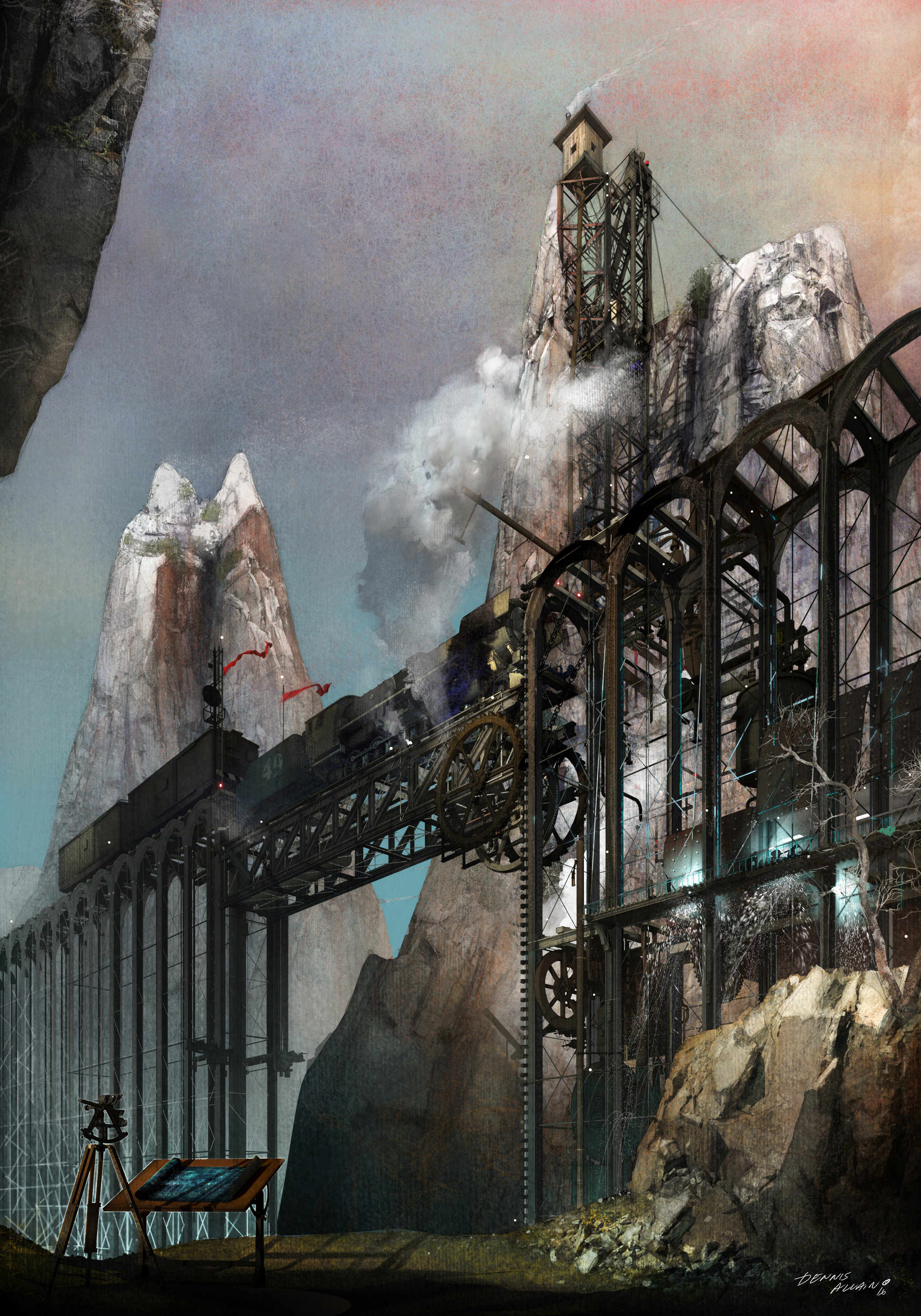
I have been trying to pull together one new self commission work per month this year. So far I am sorta close. I wanted to create an illustration that was more natural than man made. My current digital pursuits have led me to take a closer look at the works of NC Wyeth for inspiration as it pertains to color depth. This rendering is of a mountainous railway repair shop based below a seriers of lifts which host the locomatives into position for repare and replacement.
Lecture Invitation
I have recently been invited to lecture at the New England School of Art this coming March 23rd. The subject will be architectural illustration with an emphasis on story telling. The lecture is open to the public and I am really looking forward to presenting what I have observed in this profession over the years.
Jonah's Tower
This was an idea I had started earlier in 2016 and shelved it because it was coming out so crappy. I had the idea of a tower constructed in a chaotic way but no good way of telling the story . How was it built: why, how and by whom? Sometimes I have a decent scene idea with no subject or the opposite problem - an interesting subject with nowhere to place it...
The Wave
Created this image recently that had to be bright yet under the protection of shade due to the extreme climate. I had worked extensively on the design which included the shade structures and whimsical towers in the distance. I designed the 3d environment in Cinema4D and embelished the entourage and color scheme in Phtoshop CS5
Fury
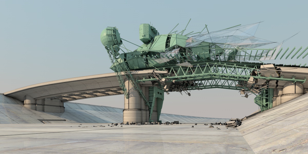
Design 3d study with no post work. This is a self inflicted project that is similar to how I design any architecture from the ground up. The design is deconstructivist in nature - which I like. The story is a bridge which is to low for larger vehicles to prowl the aqueducts so a new 'scab' is added which allows for higher clearance. This is just a progress shot. If it evolves I will end up painting it.
Open Plaza Design
The design challenge as with most large scale open plazas, is to figure out what 'happens' in it. I was charged with populating this plaza with lots of energy and some sort of projected light show. This image was all based off of blue lighting for the base 3d image in order to convey the sense of evening without looking overly dark and ominous.
The Ballet
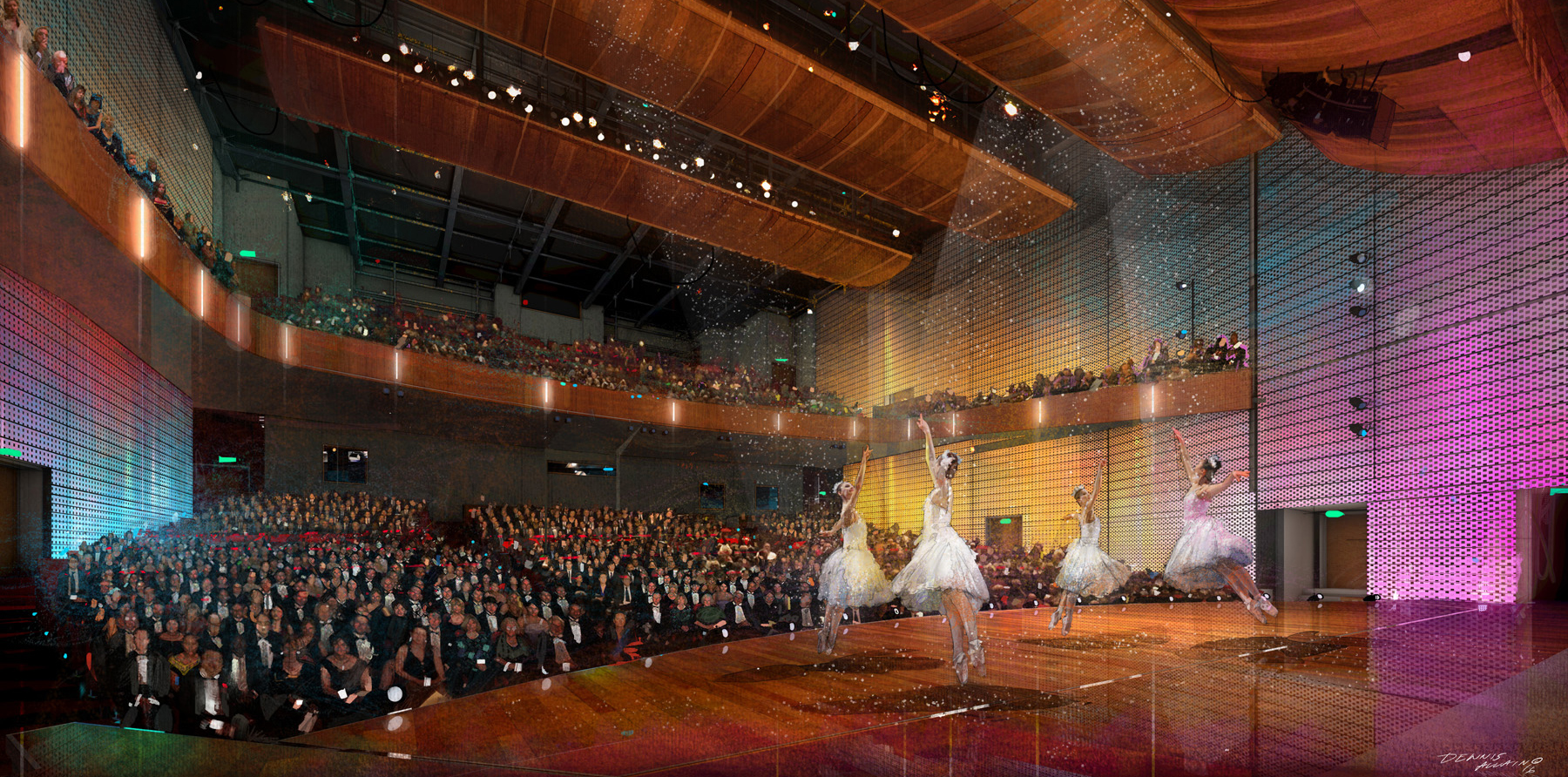
I recently completed several illustrations for a new performance center. The project consisted of both interior and exterior images. The technical definition of ballet reads; in part, as being 'characterized by light' - something we aspired to capture. This image was part of a three way collaboration between: myself, Post Architects and HMS Architects. The test; for me, was to balance depicting a traditional art form with the artistic tools of the present - the computer.
Tower Illustration
I had an opportunity to lend a hand in creating some portfolio pieces for an architect on the west coast. The design had been established. The goal was an evocative rendering that would set the tower apart from imagery that is sometimes overly photo-realistic and 'distant'. I tried to experiment with NC Wyeth inspired color palette.
KHP
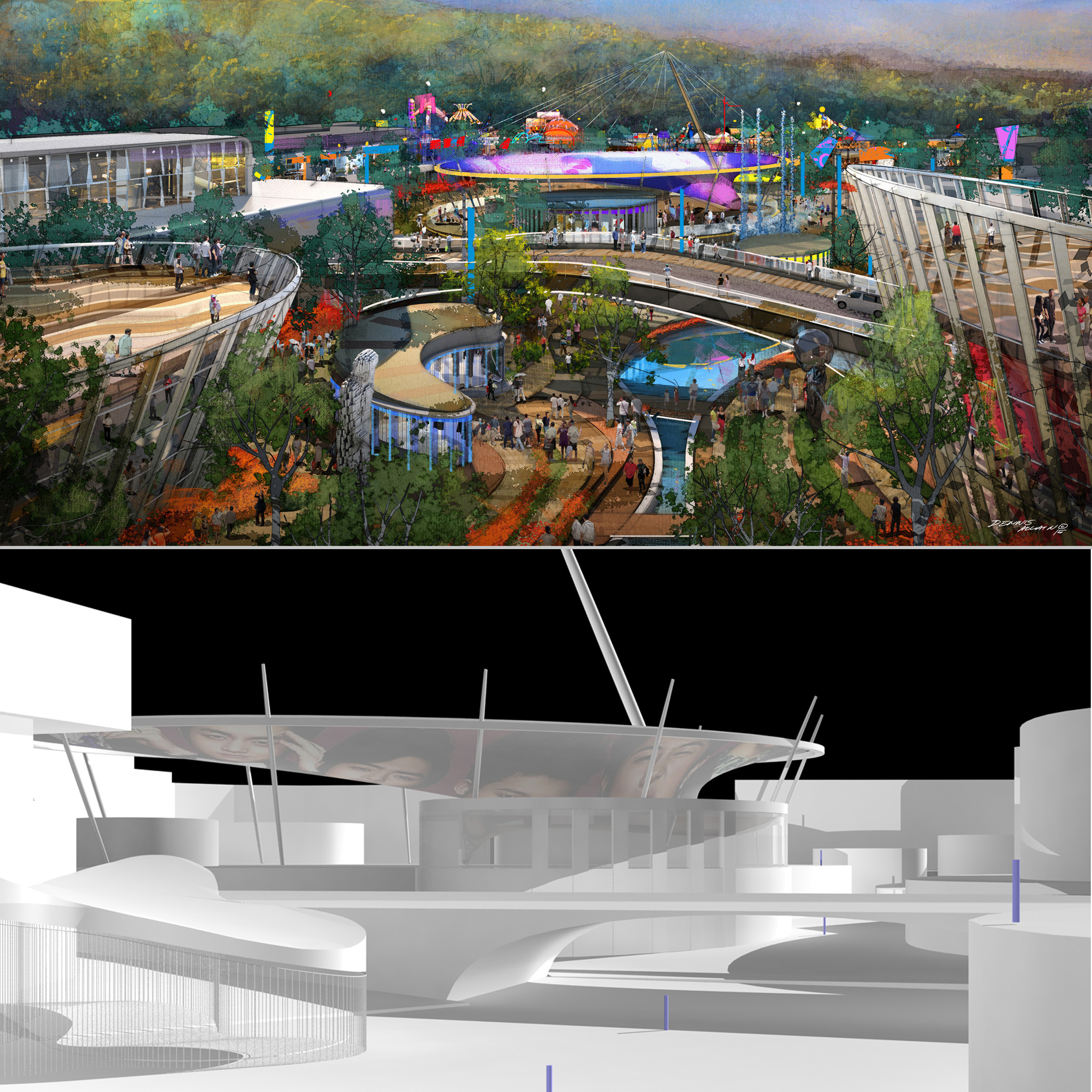
A recent competition overseas titled The Korean Horse Park. I was part of an international team that participated in the exercise. I was commissioned to create several sketches that would help tell a story. The narrative depicted a series of events that a guest would experience during there visit. This particular image was of the 'conclusion'. A rare opportunity to get a glimpse of the white horse. An almost mystical creature that provides both a climax to the journey and a deeper appreciation of nature.
Before and After
Sometimes people ask what it is I actually do. The answer is somewhat difficult to verbalize in a comprehensive way (especially given my writing skills or lack thereof) . So I often send along a series of 'before and after' images. The 'before' images are what a client might send me to evaluate a new project. Often times my studio is tasked with both adding design input as well as providing a final full color perspective. The 'after' image shows the resulting illustration created by the studio. These comparative examples are a quick visual way for me to communicate what it is my studio actually provides.
Water View
I don't often work on landscapes but I was recently commissioned to do a series of landscape illustrations for a project in the continental US. I was given photo references and some design direction in the form of sketches. Scenic illustrations done in traditional media inspired me to pursue a similar natural aesthetic. These images, although simple looking, were rather challenging to create digitally. I think the results were reasonably good and I am feeling a bit more confident with this subject matter moving forward.
Into the Altar
I had an idea to continue the 'lost explorers' theme from the cover of my website. This is supposed to be an architectonic structure emitting from the base of an older architectural vernacular. Coincidentally the dead trees in the foreground also have 'new' vegetation growing around them. I struggled with the layering effect while maintaining the spherical nature of the Apps. I thought the abandoned pack mules came out well and added scale.
The Squid
This aerial was part of a recent project that I had contributed both design and illustrative content towards. The 'squid' in the center of the project along with some of the additional surrounding massing was provided by the client. The goal was to emphasize a multitude of exciting performances that would support the central 'island' program. Relating hotel functions to these performances and attractions was also an important part of the projects overall concept.

